Well over half (61%) of America’s “small towns” (<10,000 in population) have seen a drop in population since 2010
82% of larger cities with >100,000 people saw their population increase over the same time period
Three towns with registered residents in 2010 declined to a population of 0: Mustang, TX, South Park View, SD, and Hoot Owl, OK
39 American towns have fewer than 10 residents, according to the most recent population estimates
Corning, MO had the greatest percentage drop in population (-93%, 15 people in 2010, just 1 person in 2022)
The debate about the existence of ghosts is neverending, but here’s an easier question to answer: are ghosttowns real?
In other words, are there places where people once lived, but today lack any citizens? In fact, three places in America have become ghost towns since 2010, and another 39 saw their population dip to below 10 people, according to the latest population estimates by the U.S. Census Bureau.
And these aren’t just outliers, but the mark of a trend. In America, as of 2010, 61% of towns with fewer than 10,000 residents have had a population decline. (Meanwhile, 82% of cities with at least 100,000 residents had increased their population during that same time period.)
Given this asymmetrical growth and decline, we are taking a closer look at America’s smallest cities, towns and communities to see what may have contributed to their decline, as well as highlight the fastest-emptying towns for every state.
Three New Ghost Towns, More in the Making: America’s Smallest Towns
Three towns have officially reached a population of 0 as per the most recent Census estimates. They are Hoot Owl, Oklahoma, South Park View,Kentucky, and Mustang, Texas.
While Hoot Owl, OK and Mustang, TX were incorporated with a very specific purpose (to prevent trespassing and to sell alcohol, respectively), South Park View, KY actually began as a “proper” town in 1961.
“As many as 92 towns in the United States have lost at least 50% of their population since 2010.”
After reaching a population of 196 in 2000, the town’s growth was hampered by the expansion of the Louisville International Airport, leading to serious noise pollution in the area. This development led most residents to relocate, leading the town to become virtually empty.
Apart from these three towns that have ceased to exist, a further 39 are close to disappearing off the map. Of these small towns, 32 have declined in population since 2010, with just five seeing an uptick in the number of residents.
Check out this interactive map to see the locations of America’s smallest towns.
Most of these almost-ghost towns are scattered around states in the middle of the country, forming a belt pattern from North Dakota to Oklahoma. North Dakota and South Dakota alone account for 15 of America’s towns which house fewer than 10 people. Six more such places exist in Missouri, while Oklahoma currently has five.
Disappearing Fast: Towns With the Biggest Percent Declines in Population Since 2010
As many as 92 towns in the United States have lost at least 50% of their population since 2010.
Leaving aside the towns where the population has officially gone to 0, the town with the steepest drop in population by percentage is Corning, MO (-93%), which by the books only has one official resident remaining, compared to 15 residents in 2010.
Echoing the map of America’s smallest remaining towns, the states of Oklahoma (3) Missouri (2), and North Dakota (2) account for the majority of towns with the biggest population declines.
Little is known about most of these towns and why exactly their population declined in such dramatic fashion, but it’s likely a mixture of demographic, economic, and housing-related factors.
“…the town with the steepest drop in population by percentage is Corning, MO (-93%), which by the books only has one official resident remaining, compared to 15 residents in 2010.”
Why are people leaving these places?
Put simply, “fewer births, more deaths, and more people leaving than moving in” are key factors in population decline in rural areas, according to a 2022 study from the University of New Hampshire.
Researchers at the University of Wisconsin point to the lack of housing in small towns, while an economist at Iowa State University highlights that bigger cities continue to have more and better-paying jobs, making small towns lose out in comparison.
To see all the towns and cities that lost at least 50% of their population since 2010, have a look at our interactive map. You can also see which town or city saw the highest percentage decline in population in your state by toggling “In Each State” on the interactive map.
See For Yourself: What Does Population Decline Actually Look Like?
Using statistics to describe cities, towns, and communities that see a decline in population is important, but numbers alone don’t tell the whole story.
Losing a significant share of the population has a tangible impact on a town, especially if it wasn’t that big to begin with. To capture some of those visible changes we used Google Street View to create visual comparison sliders.
Granted, these are only singular street corners that may or may not capture the essence of a given town. Still, there is something eerie and unsettling about seeing such dramatic changes in these small towns that are similarly reflected throughout different parts of the country. Which town will cease to exist next?
Towns with the greatest percentage decline in the population between 2010 and 2022 (the most recent data available) were deemed “fastest disappearing” overall. For each state, a town with the greatest percentage decline in population among towns in the same state was selected as the “fastest disappearing” in that state.
Images of 10 towns were taken from Google Streetview from the nearest years to 2010 and 2022, respectively. Images are used for illustrative purposes only and do not represent a given town or city in its entirety.
Illustrations by Maria Trigueros
2023 Study: 3 Million Moves Driven by Extreme Weather Events Last Year
3 million Americans were displaced by a natural disaster at some point in the last year
530,000 (or 18% of those 3 million) still haven’t returned home after being displaced
25% of moves forced by natural disasters are people destined for a different state
Hurricanes and storms were responsible for 51% of all the disaster-related moves in 2022
Fires are most likely to result in long-term or permanent displacement, as 45% of those displaced by fires in 2023 never returned home
In this study, HireAHelper takes a close look at moves forced by natural disasters in the United States.
Using the most recent data from the Census Bureau’s large-scale Household Pulse Survey and Current Population Survey, we focused on the number of disaster-forced moves over time, their typical destinations, as well as the types of disasters forcing most Americans out of their homes.
Displaced or Moved Permanently: Counting the Number of Americans Fleeing Natural Disasters
Census Bureau’s Household Pulse Survey puts the number of Americans displaced by a natural disaster at 3 million.
Thisfigure made national news earlier this year and represents the number of Americans who self-reported as being displaced from their home because of a natural disaster at some point in the past year. 3 million is a large number, but it’s worth noting thatmost displaced moves are temporary. According to the same survey data, 33% of those Americans who have been forced to leave their home due to a natural disaster at some point in the past 12 months return home within just a week.
A further 31% go back home within a month and 19% return after six months to a year away from their usual residence.
That said, as of May 2023, 18% of Americans displaced by a natural disaster still haven’t returned home after 12 months. This is equivalent to 533,000 people needing to figure out life in a new place after their previous living arrangement became untenable.
If we look at more permanent moves, however, the number of people who moved due to a natural disaster in 2022 is around 88,000. This figure comes from the Census Bureau’s Current Population Survey which targets “…individuals who have usual residences elsewhere,” meaning it reflects the number of people who moved permanently.
The most likely reason for the discrepancy between the number of permanent movies and the number of those still home after 12 months is timing. Current Population Survey data was released in late 2022 and could have been too early to reflect the full impact of disasters such as Hurricane Ian. In turn, Household Pulse Survey from April-May 2023 would already include people who have been displaced by extreme weather events in late 2022 and early this year.
States With the Most Americans Affected
One state stands out in terms of how many of its residents have been forced to flee their homes because of a natural disaster: Louisiana.
7.5% of people once residing in Louisiana had to, even if temporarily, leave their homes in the wake of a cataclysm in the past year — that’s one in 13 people.
“Not only is Texas by far the most common destination for moves made by those fleeing a natural disaster, but it’s also the state with the highest number of disaster refugees relative to the local population (58 per 10,000).”
Why? Even though there weren’t any singular stand-out disasters here in the past year, parts of the state are still recovering from the damage caused by Hurricane Laura in 2020 and Hurricane Ida in 2021.
The second most affected state is Florida, where 5.6% of residents found themselves displaced at one point or another in the past 12 months. And while Louisiana hasn’t experienced a major cataclysm last year, Florida had Hurricane Ian to contend with, which was one of the worsthurricanes in U.S. history.
Kentucky (2.6%), Alaska (2.5%), Michigan (2.2%), and New Mexico (2%) are the only other states where the share of those displaced by disasters rose above 2%. Everywhere else, the percentage of residents who had to leave their homes due to a natural disaster was reportedly under 2% of residents.
Wind and Fire: Disasters that Displace the Most Americans
Between hurricanes, wildfires, and tornadoes, what extreme weather events cause the greatest number of Americans to uproot their life and move?
“7.5% of people once residing in Louisiana had to, even if temporarily, leave their homes in the wake of a cataclysm in the past year — that’s one in 13 people.”
In absolute terms, it’s by far hurricanes that account for the lion’s share of displacements — 41%. Together with tornadoes, they are responsible for over half (51%) of all disaster-related moves in the United States.
Meanwhile, wildfires are responsible for 23% of all displaced moves in the past year, while floods account for 26% of such moves, depending on the source.
Events such as earthquakes, landslides, and volcanic activity also contribute to the displacement of people, though at smaller scales.
Impacts Per Type of Disaster
Despite hurricanes causing most of the displaced moves in the United States, their impact tends to be short-term. The share of those displaced by hurricanes that return home within a month is 67% and only 10% are displaced for more than a year.
On the other hand, 45% of those who escaped wildfires can’t return home even after a year of being forced out. Tornadoes have the second displacement effect with a quarter (24%) of those who had to move out because of a tornado still aren’t home after 12 months away.
Location-Based Insights:
Louisiana (7%) and Florida (5.6%) have the highest proportion of people displaced by a natural disaster in the last 12 months
Texas is the destination for 37% of all disaster-driven interstate moves since 2005
Texas (58), Tennessee (51), and Mississippi (48) are the most welcoming states, with the highest ratio of disaster refugees per 10,000 people
New York (2.7), Kentucky (2.8), and New Jersey (3) have the fewest incoming displaced moves per 10,000 residents
How Far and Where To: Top Destinations of Displaced Moves
Compared to regular moves for work or family reasons, permanent moves caused by a natural disaster tend to go a bit farther, or, at least historically.
Since 2006, two-thirds (65%) of Americans who move tend to stay within the same county, compared to just over half (55%) of those displaced by natural disasters stay nearby.
Conversely, 25% of those who moved due to a natural disaster went to a different state, compared to 15% of non-disaster-related moves, figures from the Current Population Survey show.
It’s these longer-distance moves of those displaced by an extreme weather event that reveal an interesting pattern.
Since 2006, 37% of Americans who had to resettle outside their state as a result of a natural disaster went to one state – Texas.
Not only is Texas by far the most common destination for moves made by those fleeing a natural disaster, but it’s also the state with the highest number of disaster refugees relative to the local population (58 per 10,000).
Tennessee (51) and Mississippi (48) follow as the second and third states by the number of domestic disaster refugees per 10,000 local residents.
Other states that have welcomed a significant number of displaced Americans include the three Midwestern states of Missouri (30), Wisconsin (28), and Michigan (26). Rounding off the top 10 are Arkansas and Georgia — both with 24 resettled Americans per 10,000 local residents since 2006.
State
Disaster Moves per 10,000 residents
State
Disaster Moves per 10,000 residents
Texas
58.2
New York
2.7
Tennessee
50.9
Kentucky
2.8
Mississippi
47.7
New Jersey
3.0
Wyoming
35.0
Connecticut
3.0
Missouri
30.1
California
3.2
Wisconsin
27.7
Indiana
5.1
Michigan
25.9
Nebraska
5.6
Oregon
25.5
West Virginia
5.9
Arkansas
24.4
Alaska
6.4
Georgia
23.9
Ohio
6.5
New York (2.7 per 10,000 people) and Kentucky (2.8) are the states with the lowest intake of displaced Americans compared to the local population, followed by New Jersey (3), Connecticut (3), and California (3.2), where the share of disaster-displaced new residents to the local population is around 3 per 10,000.
To see how many Americans displaced by natural disasters each state welcomed, check out our interactive map.
Tides of Change: Moves Forced by Disasters Over Time
The number of Americans who moved due to a natural disaster hasn’t reached the level of Hurricane Katrina since then. That storm was a cataclysm that claimed over 1,000 lives, forced over 1 million people out of their homes in late August 2005, and is generally considered one of the costliest cataclysms in U.S. history.
But there have been some spikes of displacements of over 100,000 that have coincided with U.S. natural disasters, such as Hurricane Ike in 2008, Hurricane Florence in 2018, and the California Wildfires of 2019.
The Current Population Survey data reflect more permanent moves, meaning the true number of people who were forced to move temporarily due to various cataclysms is likely a lot higher.
Fortunately, most Americans who had to flee their home due to a natural disaster eventually return home.
Sources and Methodology
Figures on the number of Americans that have been displaced by a natural disaster in the past 12 months, their place of residence, how long they were away from their homes, and what event caused them to leave their homes were all taken from the U.S. Census Bureau’s Household Pulse Survey.
Statistics on the number of Americans who were forced to relocate due to natural disasters over time, the length of their moves, and their destinations were taken from U.S. Census Bureau’s Current Population Survey (as available via IPUMS.)
U.S. Census Bureau’s state population estimates were used to calculate how many natural disaster refugees each state accepted per 10,000 residents.
Harvard University ranks #1 in our ranking as the school with the strongest “pull” in the country
40% of Americans who began college in 2021 moved away from home
20% of those who moved for college left their home state, down from 31% in 2020
In 47 out of 50 states, the majority of new college students enrolled in a college inside their home state
Ohio attracted almost 12% of all out-of-state college moves in 2021, more than any other state
White students (30%) were twice as likely as Hispanic students (14%) to move to college in another state
Introducing HireAHelper College Move Index: The Most Moved-To Colleges in the United States
As college enrollment declines and an increasing number of students are choosing to go to college in their home state, which U.S. colleges and universities continue to see a steady stream of American students from all around the country?
To work this out, we took 200 highest-rated U.S. colleges and collated data on:
Average miles traveled by newly admitted students from the U.S.
Percentage of newly admitted students coming from a different state
Number of U.S. states represented among new students, and
U.S. News college ranking in 2023
Based on a combination of these factors, we created a “College Move Index”. This is a ranking that compares top U.S. colleges on how much “pull” they have in terms of attracting new students from across the country.
“Of all the U.S. states, only the District of Columbia (85%) New Hampshire (53%), and Minnesota (51%) had more than 50% of their students go elsewhere to begin college.”
The colleges and universities…
With the most out-of-state students
Where a new student had to travel the longest distance to attend
Whose student body represented as many U.S. states as possible
…ranked highest on our model. Conversely, those where newly admitted students were mostly local were ranked lower.
Browse the graphic to discover the top 50 schools in the United States with the strongest “pull” for other U.S. students. You can also see how colleges compare on individual factors.
To see how the rest of the colleges we studied fared, check out the interactive table at the end of this article.
Despite Declining Enrollment, Moving to College Remains Popular
In 2022, just over 2 million Americans enrolled in college, which is 1.5% fewer than did so in 2021, according to the fall enrollment estimates produced by the National Student Clearinghouse Research Center.
This adds to the long-term trend of declining college enrollment, which stretches to 2009 — the last time the number of Americans enrolling in college or university increased year-to-year.
Still based on the Annual Social and Economic Supplement data from the Current Population Survey, as many as 827,000 Americans moved to go to college last year. That makes for a somewhat marginal increase of 0.2% compared to 2021.
College admissions have been declining for over a decade, but the number of people moving for college had a different trajectory. In 2020, for example, as many as 43% of newly enrolled students moved to attend college. In 2022, this figure is still at nearly 40%.
“The state where students were most likely to go to college locally was Utah, with 92% of new students choosing to study in their home state.”
This may be an indication that fewer people enroll in colleges close to where they live; think local community colleges or trade schools.
Meanwhile, better-known schools continue to enroll at the same pace, increasing the share of new students who relocate to attend college.
In our previous study, the average distance a new student had to move to study in one of the top 200 colleges and universities was 293 miles. That number has grown 33% higher, with an average of 390 miles.
Migration of the Minds: States that Students are Most and Least Likely to Leave
One in five (20%) students who enrolled in college in 2021 (the latest data available) left their home state, which is markedly lower than 31% who did so the year prior.
Of all the U.S. states, only the District of Columbia (85%) New Hampshire (53%), and Minnesota (51%) had more than 50% of their students go elsewhere to begin college.
In line with the findings of our previous study, the states that saw most of their students leave to go to college in another state are generally smaller, less populated states with fewer colleges and universities for local students to enroll in.
Also notable: Alaska (48%), Vermont (46%), Delaware (45%), and Rhode Island (43%) were also among the states with the highest share of students leaving to pursue a college degree in another state.
State
% of students leaving state
State
% of students leaving state
District of Columbia
85.4%
Utah
8.4%
New Hampshire
52.9%
Arizona
11.9%
Minnesota
51.3%
California
11.9%
Alaska
48.5%
Alabama
12.9%
Vermont
46.3%
Indiana
13.0%
Delaware
45.4%
Mississippi
13.1%
Rhode Island
43.0%
Florida
13.1%
Hawaii
38.4%
Louisiana
13.1%
Maryland
37.0%
Kentucky
13.5%
Connecticut
36.1%
Oklahoma
13.8%
The state where students were most likely to go to college locally was Utah, with 92% of new students choosing to study in their home state. In Arizona and California, that share was at a similarly high 88%.
In many southern states like Alabama, Mississippi, Florida, Louisiana and Kentucky, the share of students staying inside their home state for college was 87%.
“Around 30% of white students left their home state to pursue higher education, as did 28% of Asian and Pacific Islander students … [while] just 14% of Hispanic and 18% of Black college enrollees ended up moving to a different state.”
To put all these findings into greater context, it’s worth remembering that moving in 2021 was still very much affected by the pandemic, back when many people reported moving in search of safety or to better take care of their family members.
Together, these two factors may have contributed to the fact that for many new students, moving to study out-of-state in 2021 simply wasn’t an option they were willing to pursue.
Oh Wow, Ohio: Buckeye State Top Destination for Out-of-State College Moves
In a year that wasn’t a big one for out-of-state moves to pursue a college degree, where did those Americans that did move go to study? The answer may surprise you.
In 2021, the state that was the top destination for those moving to college was Ohio, which attracted 11.6% of all interstate moves bound for colleges or universities.
Remarkably, Ohio overtook the states that usually dominate these rankings: Illinois (7.8%), Texas (7.6%) and even Massachusetts (7.1%), all known for their high-profile universities.
Demographic Distance: Certain Students Are Most Likely To Move to College Out-of-State
Despite a relatively high percentage of newly admitted students who moved to go to college, how far they moved varied significantly by their demographic.
Around 30% of white students left their home state to pursue higher education, as did 28% of Asian and Pacific Islander students.
These figures are roughly twice as high as the corresponding percentages for Hispanic and Black students. Just 14% of Hispanic and 18% of Black college enrollees ended up moving to a different state.
That being said, around two-thirds of both Black (69%) and Hispanic (64%) new students were more likely to relocate to a different state county to pursue a college degree. While for white and Asian/Pacific Islander students, about a third were already living in their state’s county where they ended up going to college.
To see how schools in the top 200 of U.S. News ranking compare on how far students are prepared to travel there, see the interactive table below.
Sources and Methodology
Figures on the number and percentage of people moving to college within or outside their home state come from the Current Population Survey (CPS).
To estimate the average distance traveled by a newly admitted student, we took the school’s location and calculated the distance between its campus and the statistical population centers of each state (as defined by the U.S. Census Bureau).
All calculations are weighted, which is to say, the more students a college admitted from farther away, the greater the average distance traveled was.
Only moves within the United States are considered.
The HireAHelper College Move Index score has a maximum of 100 points and is based on a selection of 4 factors, which were weighted as follows:
Distance Travelled Score (40 points) = Estimated average miles travelled by newly admitted students
Out of State Score (25 points) = Percentage of newly admitted students coming from a different state
State Representation Score (30 points) = Number of U.S. states represented among new students
Ranking Score (5 points) = U.S. News ranking in 2023
In 2016, we reported on what it’s like to be a female mover in a majorly male-dominated industry. As you might expect, in addition to their success, the women we profiled dealt with a lot of preconceived notions about what it takes to be a successful mover from customers who questioned their abilities.
Now, over five years later, we’re taking another look to see how things have changed (and how they haven’t).
The Power of Women in Business
Carmen Ball, co-owner of LeDoux Moving Solutions, LLC, a local moving company, believes that the moving industry is a great one to be in for women, despite public perception.
“We’ve seen a lot of people come and go, only because they don’t pay attention to the little details, which I think women are good at,” she suggests.
This is an oft-repeated belief about women, but in this case, her suggestion isn’t simply fleeting. A version of this sentiment is reflected in various peer-reviewed studies which investigated key personality traits to succeed in business that go beyond knowledge, technical ability and experience. One 2016 study financed by global consulting firm Korn Ferry found that women outperform men in 11 of 12 key emotional intelligence competencies which correlate to business performance and leadership. These competencies include emotional self-awareness, empathy, coaching and mentoring, influence, conflict management and more.
Another comprehensive peer-reviewed study found that despite the wide disparity in numbers, female-led organizations are more profitable, earn higher profit margins and perform better overall versus male-led companies.
“We really started the business to change how people view moving companies,” Ball said, explaining that at the time she and her co-owner began their business, the industry as a whole had a “really bad reputation.” (The Better Business Bureau receives an average of 13,000 complaints and negative reviews about movers each year.)
“Another comprehensive peer-reviewed study found that despite the wide disparity in numbers, female-led organizations are more profitable, earn higher profit margins and perform better overall versus male-led companies.”
Ball is working to change this perception. Retelling stories of positive customer interactions that she describes as bucking the expectations of an old-school moving company, she gets as granular as even the sound of her voice over the phone. “We have a lot of repeat business because of that,” she noted.
In addition, she describes the mostly male staff she employs as responsive to her leadership. “The crew knows that I’m the one who’s keeping them going,” she said.
Unfortunately, not all women at the helm of moving companies that HireAHelper spoke to have had it as easy when dealing with male crewmembers.
Trouble with Co-workers
Another local businesswoman, Tomika Holland, recently took over J. Holland Helpers & Researchers, LLC, a small moving business in Houston, Texas. She became a co-owner alongside her mother, Sandra, after her stepfather passed away in 2021.
When asked about her relationship to men in the industry, she admitted that one of the toughest parts of her job is dealing with the male crewmembers. “They’re constantly trying you,” she explained.
“They wouldn’t do the same things with another man that they’ll do with a woman,” she added, citing repeated instances of male crew members she employs not striving for professional accountability. Holland said she feels like men in the moving industry often test her boundaries as their employer simply because she’s a woman. “It’s kind of like a child always trying their mother,” she joked.
While she’s able to make light of the situation, Holland’s experience is, unfortunately, closer to the norm than the exception. This may explain in part why so few women attempt to make their way into the moving industry. And statistics bear that out.
Moving Industry Still Dominated by Men
Despite ongoing social struggles, the share of female-owned businesses has been rising according to the U.S. Census Bureau, albeit very slowly. According to Ventureneer, a research and training group in the U.S., the number of female-owned businesses in the transportation and warehousing sector has risen by just 10% over the last five years.
Today, there are roughly 211,000 U.S. businesses operating in the transportation and warehousing sector, and only 9% (roughly 19,000) are owned exclusively by women. The cross-industry average share of female-owned businesses is only 13% nationwide.
Here’s a look at how women in transportation and warehousing compare to other industries, according to Census data.
Industry
Percent of Businesses That Are Female-Owned
Agriculture, forestry, fishing and hunting
0%
Utilities
1%
Management of companies and enterprises
4%
Mining, quarrying, and oil and gas extraction
7%
Construction
7%
Transportation and warehousing
9%
Arts, entertainment, and recreation
11%
Finance and insurance
12%
Information
12%
Wholesale trade
12%
Interestingly, there are statistical variances by geography.
Looking at the situation state-by-state, below are 10 states where the share of female-owned businesses in transportation and warehousing is highest.
State
Percent of Transport Businesses Solely Female-Owned
Tennessee
25%
Nevada
23%
Utah
22%
Indiana
21%
Georgia
21%
Virginia
20%
North Carolina
19%
California
18%
Mississippi
17%
New Jersey
17%
Tennessee tops the list, with every one in four (25%) transportation businesses being female-owned. In five other states — Nevada, Utah, Indiana, Georgia, Virginia — the share is at least 20%.
On the flip side, the share of female-owned businesses is lowest in Iowa, where businesses are just 3% female-owned. In nine other states, most of them on the East Coast, less than 10% of transportation businesses were female-owned by 2021.
State
% of Transport Businesses Solely Female-owned
Iowa
3%
West Virginia
6%
Nebraska
7%
Massachusetts
7%
Rhode Island
8%
Idaho
9%
Wyoming
9%
Kentucky
9%
Pennsylvania
9%
Vermont
9%
“You want to see some change, put a girl in it”
Shantel Jackson, a longtime female CEO of a local moving company located in Oceanside, California, has experienced firsthand how difficult it can be to establish oneself as a leader within the moving industry. But that hasn’t stopped her from doing just that.
In 2011, Jackson was living with her husband, Francis, in San Diego, California. He had been employed as a professional mover, but work opportunities with his employer were drying up in the wake of the financial crisis and The Great Recession. In response, he decided to resurrect an old moving business he originally founded in 2006. With the reopening of “Speed Loaders”, he would try his hand at running his own moving company, instead of working for one.
“Today, there are roughly 211,000 U.S. businesses operating in the transportation and warehousing sector, and only 9% (roughly 19,000) are owned exclusively by women.”
In a short amount of time, the Jacksons obtained a business license and started booking jobs. They joined HireAHelper, a national online marketplace where moving companies can list their local moving business. Shantel, who before helping her husband worked as a statistical analyst for the Metropolitan Transit Authority, changed careers and began handling things behind the scenes.
True Change Comes From the Top
The company was successful and grew steadily over a decade. But by 2016, Francis was experiencing health issues that left him unable to work.
To keep the company going, Shantel Jackson took over the business as its CEO.
Shantel described to HireAHelper that taking over the business often meant 17 hours of work per day. Adding to the stress of the situation, the group of employees who worked for Speed Loaders at that time (which Shantel described as a “good ol’ boys club”) reportedly didn’t appreciate having a female boss, especially after having presumed they would be put in charge of the company after her husband stepped away. Jackson described her appointment as making them difficult to manage.
“So I got rid of every last one of them,” she said.
Today, Jackson (and her new crew) have instilled a company culture and direction that have led Speed Loaders into solvency and customer acclaim; as of 2022, Jackson has directly overseen well over a thousand moves on HireaAHelper.com alone, all of which has been rated 4.7 out of 5 stars in aggregate.
In addition, Jackson encourages pro-bono work within Speed Loaders, telling HireAHelper stories of deeply discounted moves for higher-risk individuals such as single mothers and returning military members.
“We go the extra mile,” she said. “As my daddy would say, you want to see some change, put a girl in it.”
A Recurring Theme
Both anecdotal and economic evidence suggests the reason there are so few women in industries like moving and labor isn’t necessarily because it’s too difficult, but because there still seems to be a permeating anti-female culture.
Studies find that some of the biggest challenges women face in male-dominated industries include societal expectations and beliefs about a woman’s ability to work comparatively well to men, as well as pervasive stereotypes which often contradict research on effective leadership.
Further, in one 2017 Pew Research survey, 28% of women working in male-dominated industries said they had personally experienced sexual harassment, as compared to 20% of women working within female-dominated industries.
“It takes a very strong woman (to be successful in the moving industry),” Holland asserted. Indeed, women like Tomika Holland, Carmen Ball and Shantel Jackson have proven that they have the mental, emotional and physical fortitude to run a thriving company in a tough industry. Hopefully, the positive changes these women and others like them are making will help push the labor industry to be an increasingly welcoming one for women.
And if not, signs show they’ll keep on trying. Despite the potential challenges, Holland said she hopes to pass down the business to her kids one day, just as her parents did for her.
When the late, great Meatloaf sang about doing anything for love — except that — maybe he was referring to moving.
About one in four adults have moved for love at some point in their lives, according to a 2019 HireAHelper survey. But it appears that far fewer people are doing so today. In 2020, approximately 1,527,685 people moved for romantic reasons. By 2021, that number dropped to 1,067,234, representing a 30% drop.
It may be that pandemic-era flings are losing their luster, or most everyone interested in shacking up already has. But which generation is most likely to relocate for love? And where are they going?
Here’s a closer look at the current state of moving for love.
Who’s Relocating for Love?
In 2020, the top overall reason for moving was because of a new job or transfer, according to the U.S. Census Bureau. That’s not too surprising, considering more than a third of U.S. workers changed employers or lost their jobs since the start of the pandemic — which is double the normal amount over the past two decades.
But where did romance rank?
“Relationship with unmarried partner” ranked pretty far down the list, at 6% of moves.
In 2021, the top reason for moving was “to establish own household,” followed by “other family reason.” Ending a long-distance relationship was once again a much lower priority, this time representing fewer than 5% of all total moves.
Top Reasons for Moving 2021 vs. 2020
2021
2022
Reason
# of Moves
% of Moves
# of Moves
% of Moves
To establish own household
2,878,137
12.8%
3,170,762
12.5%
Other family reason
2,481,267
11.1%
2,596,415
10.2%
For cheaper housing
2,408,044
10.8%
1,977,655
7.8%
New job or job transfer
2,386,871
10.7%
3,399,284
13.4%
Wanted to own home, not rent
2,020,061
9.0%
2,328,100
9.2%
Wanted better neighborhood
1,616,836
7.2%
1,232,599
4.8%
Other housing reason
1,541,679
6.9%
1,888,797
7.4%
Change in marital status
1,287,273
5.7%
1,826,587
7.2%
For easier commute
1,170,450
5.2%
1,464,583
5.8%
Other reasons
1,156,188
5.2%
1,045,606
4.1%
Relationship with unmarried partner
1,067,234
4.8%
1,527,685
6.0%
Attend/leave college
824,236
3.7%
938,023
3.7%
Health reasons
434,010
1.9%
596,470
2.3%
To look for work or lost job
405,254
1.8%
520,348
2.0%
Retired
226,812
1.0%
397,874
1.6%
Change of climate
202,123
0.9%
115,352
0.5%
Foreclosure or eviction
127,983
0.6%
189,659
0.7%
Natural disaster
86,752
0.4%
111,014
0.4%
Other job-related reason
77,548
0.3%
114,439
0.4%
Most moves that occurred because of a relationship with an unmarried partner were local. Sixty percent of those moves took place within the same county. Still, more than a quarter of people who moved for love relocated somewhere else in the state, while 13% moved out of state.
How Far Are People Moving for Love?
Relative move distance
Percent of moves for love
Moved within county
60%
Moved within state, different county
27%
Moved between states
13%
When it comes to men and women, moves were pretty evenly split between the two in 2020 and 2021. However, there is one generation that’s far more likely to move for love: millennials.
“Most moves that occurred because of a relationship with an unmarried partner were local.”
Considering that the oldest millennials turn 40 this year, they’re in the prime life stage for finding a forever partner and settling down. Boomers, on the other hand, are pretty unlikely to move for a romantic partner — only 4% of moves for love took place among Boomers last year.
Who’s Moving for Love?
Group
2021
2022
Men
50%
48%
Women
50%
52%
Gen Z
33%
34%
Gen Y (Millennials)
51%
46%
Gen X
12%
13%
Baby Boomers
4%
8%
Where Are People In Love Moving To?
When we look at where people who moved for love ended up, there are some big differences between states.
This seems reasonable, considering they’re also the largest states in general. However, there were a few smaller states on the list — including North Carolina, Virginia and Tennessee — which also saw a large influx of new residents during the pandemic as people fled high cost-of-living areas.
State
Percent of People Moving Who Relocated There for Love
Texas
14.0%
Ohio
9.1%
Illinois
6.8%
Florida
6.5%
North Carolina
6.4%
Virginia
5.9%
Tennessee
5.8%
California
4.9%
Arizona
4.6%
Utah
4.3%
Breaking it down by gender self-identification, the states of Illinois, Florida and North Carolina were the most popular destinations for men who moved for love. Women also favored Illinois, as well as Texas and California.
“In 2020, approximately 1,527,685 people moved for romantic reasons. By 2021, that number dropped to 1,067,234, representing a 30% drop.”
Below, you can see the top 10 states where both men and women moved for love (percentages are based on the entire population of people moving in 2021, according to the US Census Bureau).
State
Percent of Men Who Moved for There for Love
Illinois
9.2%
Florida
8.2%
North Carolina
7.8%
Texas
6.7%
Colorado
4.7%
Pennsylvania
4.5%
California
4.4%
Virigina
4.2%
Ohio
4.1%
Tennessee
4.1%
State
Percent of Women Who Moved There for Love
Texas
13.42%
California
6.83%
Illinois
6.33%
Florida
6.12%
Colorado
4.81%
Pennsylvania
4.55%
Tennessee
4.46%
Missouri
4.19%
Michigan
3.82%
Utah
3.55%
As far as the cities where most people landed, the majority weren’t major cities, but smaller towns and the countryside (14.5%). Many more relocated to the Chicago-Naperville-Joliet metro area (IL-IN-WI, 7.6%) and Raleigh-Carey, NC (3.5%). Below is a list of the top 10 metro areas that received the most movers looking for love.
Metro Area
Percent of People Moving Who Relocated There for Love
Chicago-Naperville-Joliet, IL-IN-WI
7.6%
Raleigh-Carey, NC
3.5%
Los Angeles-Long Beach-Anaheim, CA
3.0%
Houston-Baytown-Sugar Land, TX
3.0%
Orlando, FL
2.8%
New York-Northern New Jersey-Long Island, NY-NJ-PA
2.4%
St. Louis, MO/IL
1.9%
Austin-Round Rock, TX
1.8%
Dallas-Fort Worth-Arlington, TX
1.8%
Miami-Fort Lauderdale-Miami Beach, FL
1.8%
Methodology
Unless otherwise stated, all the data behind the charts in this study was taken from the U.S. Census Bureau’s Current Population Survey and its Annual Social and Economic Supplements for 2020 and 2021. For the purposes of this study, moves that were made due to “relationship with unmarried partner” (a category introduced by the U.S. Census Bureau in 2020) were catergorized as moves “for love.”
The best town for working remotely in the US is Gatlinburg, TN
Three Delaware towns are in the top 10 most remote-friendly places in the country
Leland Grove, IL is the smallest town in the top 10, with 1,464 residents
As more and more people choose (or are forced) to work remotely, many are realizing they don’t necessarily have to live in the big cities where their employers tend to be based. In fact, they can move to save money. If you can work and be productive remotely, why endure a concrete jungle with barely affordable rent, high cost of living, and a crowded commute? Working from home is in.
To help all the remote workers out there, HireAHelper created an algorithm that ranks a town’s internet accessibility, cost of living, and much more in order to figure out where the best places to work remotely in 2020 are.
Lo and behold, HireAHelper’s ranking of the top places for working remotely in the United States!
See the chart below to explore the rankings. Check how towns compare on the overall scores, plus compare the top 50 towns on individual factors.
The Top 10 Towns
The top of our table offers something for everyone. From mountainous Gatlinburg TN and Manitou Springs, CO, to the suburban Leland Grove, IL, and Collingwood, NJ.
And of all the towns, Delaware somewhat surprisingly dominates. The Diamond State, with its affordable high-speed broadband, excellent local amenities, and plenty of open green spaces, has a total of three towns land in our top 10!
Here is each town in our top 10, all perfect for your next Zoom meeting.
= Financials (i.e., cost of living, local income, property and sales tax rates, housing prices)
= Comforts (i.e., coffee shops, restaurants)
= Broadband offerings (i.e., terms of coverage, speed, and cost, & free Wi-Fi hotspots)
= Conditions (i.e., greenery, open-air, air quality)
1. Gatlinburg, TN |
Gatlinburg, TN
Winning the #1 spot in the ranking, it’s Gatlinburg in Tennessee. On the doorstep to the Great Smoky Mountains National Park, this town is affordable, has a reliable 2 GB internet connection, and no shortage of places to grab a hot brew or a bite to eat. Not to mention, you have access to lots of green spaces inside one of the greatest national parks in the country.
2. New Castle, DE |
Closely behind in second place is New Castle in Delaware. Set on the outskirts of Wilmington, New Castle offers a manageable cost of living, speedy broadband, and plenty of spots for food and coffee. It’s a town full of quaint charm, but one thing that put New Castle so high in our ranking is a relatively low house pricing compared to many other towns in Delaware, and beyond.
3. Lewes, DE |
Another historic beach town in the state of Delaware, Lewes combines the charm of an East Coast beach town that offsets a lot of the East Coast cost of living with Delaware’s famously low taxes. Add a strong local food scene and some affordable high-speed internet, and you’ve got yourself one of the greatest towns for remote working.
Moving far away?
Do it cheaper.
HireAHelper.com can save up to 40%, compared to traditional interstate moving companies. Click here to learn how.
4. Collingswood, NJ |
Despite being a proverbial stone’s throw away from Philadelphia, Collingswood in New Jersey town was able to preserve its small-town feel. Benefitting from a fair number of parks and coffee spots, here you also find some relatively affordable housing, along with the ubiquitous fast-speed broadband.
5. Leland Grove, IL |
Leland Grove, IL
Another suburban entry on our top ten is Leland Grove, just outside Springfield in Illinois. Much like in other places at the top of our list, here the houses are affordable, coffee spots – plentiful, and broadband – cheap and fast.
6. Rehoboth Beach, DE |
A third Delaware town in our top ten, and similarly to its counterparts, Rehoboth Beach mixes colonial history with its beach town charm. Despite the relatively high cost of living and house prices, the taxes are “Delaware low”, and with excellent internet connectivity and no shortage of coffee shops, this 1,500-strong town is firmly in the sixth spot on our list.
7. Manitou Springs, CO |
Manitou Springs, CO
Situated in the foothills of the beautiful Rocky Mountains, the town Manitou Springs in Colorado boasts unrivaled access to scenic parks, hiking trails, and some of the freshest air in the country. On top of that, it has plenty to offer in a way of food and coffee… not to mention the fast internet and low taxes. What’s not to like?
8. Southport, NC |
Southport, NC
Back on the East Coast, another attractive town beckons. This time, it’s Southport in North Carolina. Come for the attractive combination of good parks and glorious ocean views, stay for the burgeoning restaurant scene and affordable housing.
9. Nevada City, CA |
The highest-ranking Californian town in our rating is Nevada City. This old Gold Rush town wins its spot by offering its residents excellent internet connection for a good price, a decent selection of food and coffee, and some incredible parks and hiking trails.
10. Winter Park, FL |
Hardly any ranking is complete without an entry from the Sunshine state, and the one on our list is Winter Park. Close to Orlando, it might not be the cheapest around, but it’s renowned for its vast green spaces and has excellent amenities in terms of coffee, Wi-Fi, and not to mention high-speed home internet. And it’s hard to beat that Florida sunshine.
What Are the Best Remote-Friendly Places in My State?
America’s best places for remote work might not be in your state, but don’t worry, we found that each state has a town or a small city suitable for working away from the office.
Check out our handy city-finder map down below. You can search through the highest-rated remote-friendly location in your part of the country.
Affordable, Connected, Green: How We Ranked the Towns (and 382 More Great Places)
To get started with the places we were going to choose from, we rounded up some of the most beautiful towns in America. (If you’re going to move somewhere to work remotely, it might as well be beautiful, right?). To do this, we relied on various articles, like this one from The Culture Trip, to find the most attractive places in each of the 50 states to work from home in.
Then, using the data from the US Census Bureau, we filtered anywhere with a population less than 1,000 and more than 50,000, leaving 392 towns on our final list.
To rank them all, we crunched the numbers on four different factors, then aggregated them.
To get a sense of what living in each town is like financially, we gathered the estimates of the cost of living, local income, property, and sales tax rates, as well as housing prices.
A speedy and reliable Internet connection is critical to successful remote set-up, so we looked up each town’s broadband offering in terms of coverage, speed, and cost. Plus, we counted up the free Wi-Fi hotspots in the area.
Living in a small town doesn’t have to mean missing out on good food and coffee, so we estimated the number of coffee shops, restaurants, and food delivery options for each town in our selections.
Finally, the big draw of living in a small town is fresh air and access to green spaces, which is why we looked at the number of parks and hiking spots around each town, took in data on air and water quality, and threw in an estimate of weather comfort to round off the rankings.
If you’re keen to explore the data in more detail, check out the full table below with all 392 towns we profiled.
Sources and Methodology
The sources of data used in the piece are as follows:
Where you grow up not only determines a lot of your personality (and what you like), but it can determine your overall quality of life too.
There can be drastic differences between someone who grew up in New York vs. Los Angeles, and the difference is even more striking if you grew up in a different country with a different culture. After all, a child in Thailand will have a drastically different experience than one growing up in Ireland.
Life Comparison Tool
Have you ever imagined what your life would be like if you moved somewhere vastly different from where you are now? Where would you choose to live? What would you spend your time doing? How would life be easier or more difficult?
Comparing things like life expectancy, unemployment rate, average purchasing power, median age and access to the internet can give you a better idea of how other cultures live. So we built this handy tool to let you do just that!
Start by picking your “country of origin” by choosing it from the list below. Next, pick the country you’d like to compare it to and analyze the different statistics.
Feel free to mix and match as you choose—be curious!
compared to
You are years olderyounger.
You are % lessmore likely to have AIDS.
Your country would have % lessmore debt.
Your nation would spend % lessmore on education.
You would have % lessmore free time.
You would make % lessmore per year.
You would have % lessmore saved.
Your country would be % lessmore active on the internet.
Migration reports are out in full force, including the famous United Van Lines yearly report.
But while United handles more moves annually than any other mover network in the country, their numbers are not definitive across the industry board.
North American, Atlas and Allied all see slightly – and in some cases, wildly – different results in their migration study results. Not a surprise, because as a Full Service move provider, United handles a somewhat different clientele compared to companies like ABF, U-Haul and PODS – companies whose numbers might look a lot different. Then there’s that little thing called the Census.
Yep, the state-to-state migration numbers for 2017 are out – and folks, we have new inbound state champions! Here are the results:
United Van Lines
Vermont Takes United 2017 Inbound Crown
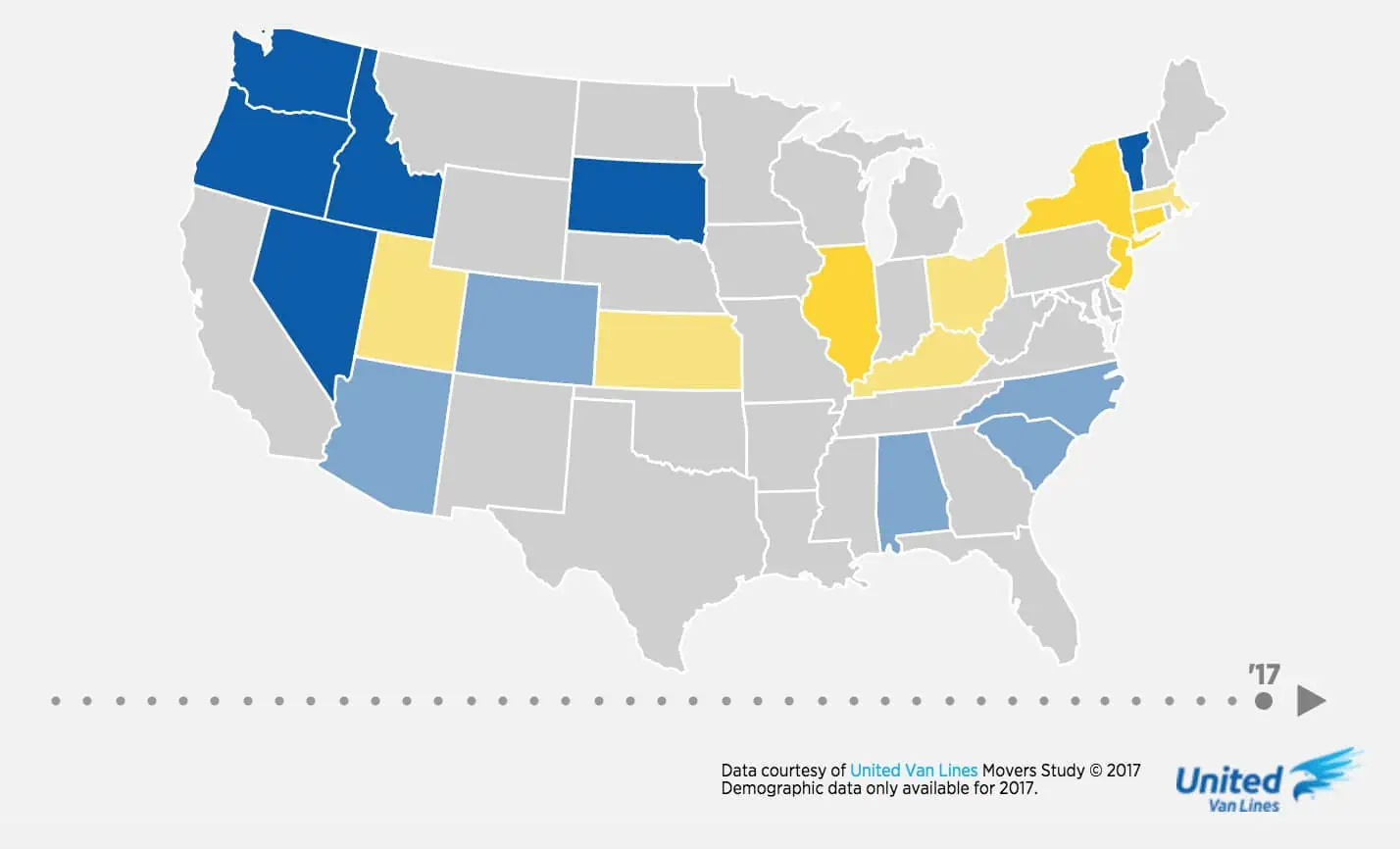
In 2015 they came in at third on the inbound rankings. In 2016 they inched their way up to number two. Now, this tiny state known mainly for skiing and maple syrup has captured the coveted top inbound spot on United’s 2017 National Movers Study.
Yes, the champagne is indeed flowing like syrup in Stowe, Killington and Montpelier as Vermont looks back on a year that saw a whopping 68% of their interstate moves coming in.
Reasons
According to United’s survey, “family” was the most common reason respondents gave for relocating to the Green Mountain State. Retirement, lifestyle and job also figured fairly evenly into the equation.
On the other hand, a full 75% of people moving out of state gave employment as their reason. This helps explain why half of all outbounders fell into the Under-35 age category – and another 25% were between 35 and 45 – while 40% of those moving into the state were 65 or older.
Those mountains may be green, but with those unemployment numbers, it looks like the valleys are starting to turn gray.
But before we start replacing all those ski lifts with wheelchair-friendly escalators, let’s take a step back and look a little closer at where the stats behind Vermont’s inbound crown come from. Keep in mind we don’t know how many moves Vermont actually saw by their report. (68% can be broken down to 17 inbound moves and 8 outbound moves – which hardly amounts to a mass migration to this land of wooden bridges and Bernie Sanders.)
Inbound:
1. Vermont
2. Oregon
3. Idaho
4. Nevada
5. South Dakota
6. Washington
7. South Carolina
8. North Carolina
9. Colorado
10. Alabama
This past year saw some familiar names on United’s Top Ten Inbound States list. Oregon, Nevada and North Carolina are all there, as they have been every year since 2011. Washington, Idaho, South Dakota, South Carolina and Arizona are also back after making 2016’s inbound list. Newcomers include Alabama and Colorado. Meanwhile, Florida has dropped off the inbound list after a strong three-year run.
This past year’s top inbound states are also fairly spread out around the country. The same cannot be said about United’s outbound states.
Outbound:
1. Illinois
2. New Jersey
3. New York
4. Connecticut
5. Kansas
6. Massachusetts
7. Ohio
8. Kentucky
9. Utah
10. Wisconsin
As with the previous few years, the major exodus seems to be coming out of the Northeast and the Midwest, with Utah adding a little “outbound yellow” to the otherwise blue western region on United’s interactive migration map.
Perennial outbound states New York, New Jersey, Connecticut and Illinois have been the most unfortunate ones; we’d have to go back to 2010 to see any of them as balanced. (New York and Connecticut were both spared the shame that year).
North American Moving Services
northamerican.com
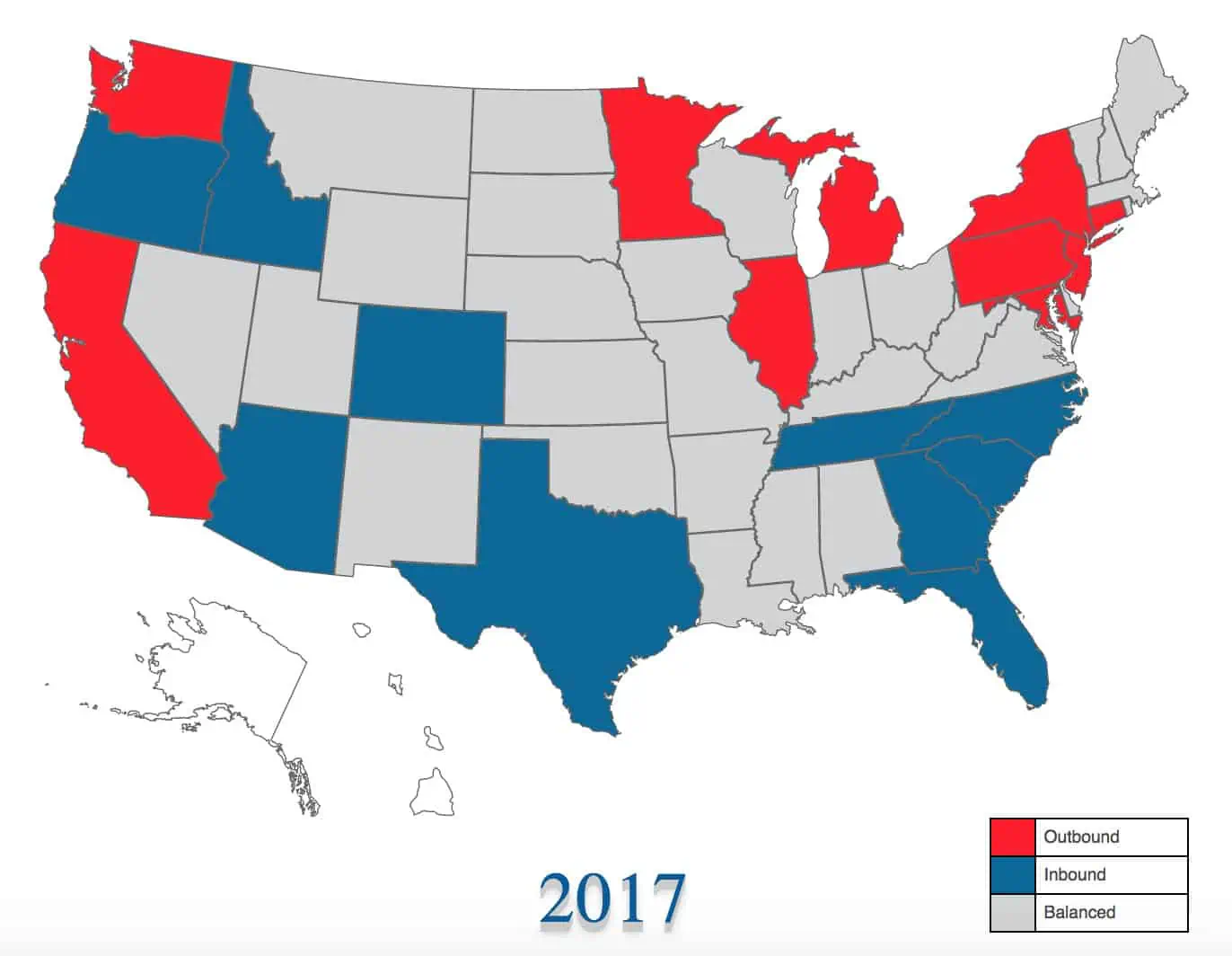
Arizona Takes North Americans 2017 Inbound Crown
North American’s inbound champ is Arizona, with 67% of their interstate moves coming into the Grand Canyon State. Other top inbounders not on United’s list include Tennessee, Florida, Georgia and Texas – all south and southeast states. (Those North American drivers must really love the south.)
Inbound:
Arizona
Idaho
North Carolina
South Carolina
Tennessee
Outbound:
Illinois
Connecticut
New Jersey
California
Michigan
Like United, North American has Illinois, New Jersey and Connecticut at the top of their outbound list (with New York a notable #8). But the rest of their top outbounders – California, Michigan, Pennsylvania, Minnesota and Maryland (#4-8 on the map) aren’t even on United’s radar.
Interestingly, North American’s #10 outbounder is Washington, which ranks #6 on United’s inbound list.
In accounting for these discrepancies, it is worth noting what North American says of their report’s methodology:
“We define the top inbound and outbound states as those that have the highest proportion of moves where the absolute value difference of inbound and outbound moves is greater than or equal to 400. This weeds out states that had a small number of moves but would have a high ratio of inbound/outbound moves.”
This may explain why United’s 2017 champ Vermont and #5 South Dakota (United’s #1 in 2016 by the way) aren’t anywhere on North American’s Top Ten.
Atlas Van Lines
atlasvanlines.com
Washington Takes Atlas 2017 Inbound Crown
Atlas Van Lines offers some relative surprises too. Idaho, Washington and Nevada as their top three inbounders may not raise any eyebrows. But Alaska, Maine and New Hampshire at #5, #6 and #10? Oregon is a familiar name, but seeing them at #8 seems in contrast to their recent United Van Lines inbound championships.
Atlas’s top outbounder, meanwhile, is Illinois (same as both United and North American – those Fighting Illini have a real stranglehold on that top spot!). And their #2, West Virginia, was a strong outbounder for United for six years straight before balancing out in 2017.
But Nebraska at #3? Nebraska has been balanced for United since 2001! And #4 outbounder South Dakota has been an inbound darling for United the past three years.
Rounding out the Atlas top outbound list are Hawaii, Indiana, Delaware and Louisiana, all of them somewhat surprising since three of them have spent the last ten years on United’s “balanced” register. Only Indiana has managed to make a blip on United’s outbound radar in that time frame.
Inbound:
Idaho
Washington
Nevada
Tennessee
Alaska
Maine
North Carolina
Oregon
Alabama
New Hampshire
Outbound:
Illinois
West Virginia
Nebraska
South Dakota
Hawaii
Indiana
Delaware
New York
Louisiana
Kansas
In contrast to the percentages United and North American provide, Atlas gives actual numbers of inbound and outbound moves for each state. Here we see that Vermont has seen just a fraction of the moves so many other states see, so it’s easy to imagine why they wouldn’t have made it onto North American’s list. (Meanwhile, once again, Canada’s Yukon Territory has seen zero moves. We’ll blame it on the roads.)
Allied Van Lines
allied.com
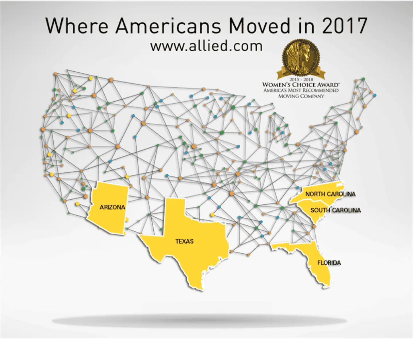
Florida Takes Allied 2017 Inbound Crown
Allied Van Lines keeps it all very short and sweet. They report only their top fives:
Inbound:
Florida
Arizona
North Carolina
South Carolina
Texas
Outbound:
California
Illinois
Pennsylvania
New Jersey
Michigan
Based on this limited report, we’re able to come to at least one solid conclusion: Allied’s drivers love moving people south even more than North American’s do.
U-Haul
Texas Takes U-Haul 2017 Inbound Crown
Because news outlets predominately focus on Full Service van lines, it can easily be argued this eliminates an entire sector of the migrating public. (In fact, Full Service van lines actually conduct less than half of all moves performed in the US every year.)
Do U-Haul’s numbers reflect what the van lines suggest are moving trends?
Nope.
Inbound:
Texas
Florida
Arkansas
South Carolina
Tennessee
Washington
North Carolina
Connecticut
Colorado
Vermont
Outbound:
California
Illinois
Pennsylvania
Michigan
Massachusetts
New Jersey
New York
Arizona
Maryland
Georgia
Texas tops U-Haul’s 2017 Growth States list. This shouldn’t come as a huge surprise, as Texas has fared well recently in the inbound-outbound game. In 2017 their inbound percentages with United, North American and Atlas were 54, 53 and 53, while Allied put Texas down as their fifth biggest inbound state.
Oddly, Texas won U-Haul’s Growth State crown by bringing in – get this – a whopping 50.3% of all one-way truck rental traffic crossing Texas’s borders. That’s right. Fifty. Point. Three.
This hardly lends a whole lot more understanding to the migration trends we’re trying to dissect. But here we are, so let’s keep moving.
U-Haul rounds out its top five Growth States with Florida, Arkansas, South Carolina and Tennessee. Yes, Arkansas – which has been balanced on United’s report 37 of the last 40 years. Then again, Arkansas remained balanced in 2017 on United’s ledger with a 54% outbound rate, so that they are U-Haul’s #3 Growth State is rather surprising no matter how minuscule their positive U-Haul balance might have been.
And who comes in at #8 on U-Haul’s list? That big loser with United and North American (but not with Atlas), Connecticut.
On the flip side, U-Haul has Colorado at #9 – exactly where United and North American have them.
United States Census Bureau
Idaho Takes United States Census Bureau 2017 Inbound Crown
Yes, the Bureau has all the moving numbers we could possibly want. So many, in fact, that it could take until next January to weed through them all.
But thanks to Business Insider we don’t have to.
In this piece with the strangely long title: While the Bureau considers “a variety of components” in determining what’s happening among the more than 325 million people who make up the US population, Business Insider brings us what we need: domestic migration.
Here we see the net population gain or loss for each state for 2017. Births, deaths and international immigration are not counted; this is simply and strictly an account of how many people moved into or out of each state. (Again, not moves, but individual people.)
Inbound:
Idaho
Nevada
South Carolina
Oregon
Arizona
Washington
Montana
Florida
Colorado
North Carolina
And in this, the winner is Idaho, with a net domestic migration gain of 14.6 people per 1,000 residents. In second place comes Nevada, with South Carolina, Oregon and Arizona rounding out the top five. The second half of the big ten winners are Washington, Montana, Florida, Colorado and North Carolina.
These results actually mirror the van lines’ findings to a striking degree. Only Arizona, Montana and Florida don’t show up in United’s top ten. Seven of the Census top ten are also on North American’s top ten. Unbelievably, Colorado is #9 on all three lists.
As for the Net Domestic Migration losers? Yes, Illinois is up there, but at #5, maybe this is the survey they should be talking about in Chicago.
Outbound:
Wyoming
Alaska
New York
Hawaii
Illinois
North Dakota
New Jersey
Connecticut
Louisiana
West Virginia
The big loser in the 2017 migration tournament is Wyoming, a surprise since the Equality State doesn’t show up on any van line outbound lists – or inbound for that matter. United had them at 53% inbound for 2017. North American had them at 54% in. Only Atlas has them as outbound – based on a grand total of 330 moves.
The Bureau’s next three biggest net migration losers are Alaska, New York and Hawaii. Alaska and Hawaii, neither of which show up anywhere for United or North American, are Atlas’s #5 inbound and #5 outbound, respectively. North Dakota, New Jersey, Connecticut, Louisiana and West Virginia complete the Bureau’s top ten.
Again, while there are outbound wild cards, we still see some consistency between the Bureau and the van lines. Atlas and the Bureau actually have seven migration losers in common between their top tens. Looking at the US Census Bureau’s Net Domestic Migration map we can clearly see the winners clustered in the south and west with the losers dominating the northeast and midwest.
What’s The Takeaway?
Remember, the numbers put together by each of the van lines represent the migration trends among the customers they’ve served. Van lines count moves, the Bureau counts people.
This may not account for the reason United’s inbound champion Vermont is somehow a net loser according to the Census Bureau’s numbers, but it does suggest that, despite the discrepancies, the van lines and the Census Bureau can give a decent overall on what is going on out there.
But in the cases where data remains too contradictory to be meaningful, evaluating regions rather than individual states might give us a slightly more reliable picture of the migration trends playing out across the US. At the end of the day, we are only looking at a mere slice of the American migratory pie.
There’s More Realistic Data Out There
We need another, more encompassing way to look at where America is moving to and from.
DIY Moves and Hybrid Moves (besides U-Haul), which by far and away are the more common ways to move, are sorely misrepresented. When you move, do you routinely call up $2,000+ movers? Have you ever saved money by having your friends move you? What are these Full Service reports actually reflecting?
That’s something to keep in mind when the local news sounds off on “moving trends” based off a single Full Service Moving company’s report.
×
I'm Moving
Moving? Thinking about moving? Whether your move is off in the distance or you already have one foot out the door, you'll learn about everything you should expect through our useful how-to's, cool articles and much more. It's all specially curated for you in our "I'm Moving" section.
For rookies or veterans alike, our "I'm a Mover" section is filled with extensive industry news, crucial protips and in-depth guides written by industry professionals. Sharing our decade of moving knowledge is just one way we help keep our professional movers at the top of their game.
 The debate about the existence of ghosts is neverending, but here’s an easier question to answer: are ghost towns real?
 Displaced or Moved Permanently: Counting the Number of Americans Fleeing Natural Disasters
 This is an oft-repeated belief about women, but in this case, her suggestion isn’t simply fleeting. A version of this sentiment is reflected in various peer-reviewed studies which investigated key personality traits to succeed in business that go beyond knowledge, technical ability and experience. One 2016
  When we look at where people who moved for love ended up, there are some big differences between states.